TIKT - Android App
PERSONAL PROJECT
Paper Prototyping | User Testing | Branding
Illustrator | InVision | InDesign
As an avid follower of all things Google, I was impressed with their Material design visual language and started to notice more and more apps applying their rules. After exploring the resources online, I set about to try and create my own app adhering to their design principles. I decided to create a modern task app, with a scenario loosely based within a shared house by a family or house-mates. This was a quick turnaround personal project and allowed me to do user testing with low fidelity prototyping utilizing basic pen and paper materials before moving towards a finished polished piece, resulting in a high-fidelity mock-up prototype prepared in sketch and InVision.
I’m confident TIKT will check your box.
COMPETITIOR ANALYSIS
To start the project off, I selected a few existing task apps available and downloaded them to have a play around on my mobile device, tablet and laptop. I did a strength and weakness analysis to find some insights and determine where they might be failing and features I could improve.
WEAKNESS
- Google product, so integrates with Google calendar and Gmail, etc... Also has familiar interface for frequent users of Google services.
- Drawing feature allows you to doodle notes and ideas, not limited to a keyboard and type.
- Operates as an individual app but would be useful if worked in unison with mail or other Google apps. No need to save reminder and alerts on all platforms.
- Can’t link numerous Google accounts into one Keep account (like Calendar). Have to access each account separately.
- Interact immediately with a task and select further actions - slide right, slide to the left to complete - DONE. Quick and easy.
- You can set up all aspects of the task. i.,e. type,calendar,priority flag,labels and file uploads when creating the task.
- You have to dig around the menu options to only view each filter on its own, with no comparison. Apart from viewing ALL.
- Once you complete a task it automatically disappears with a small undo button. After searching I realized these get sent to ‘completed tasks’, hard to find.
- Great desktop app, I can see everything at a glance and add as much or as little detail as I wish. Mobile app is simple and easy also.
- Automatic tagging of many features in the typing field. This is enabled a lot more quicker and easier than other apps I have used.
- The UI is very plain and corporate. It's hard to distinguish folders and options from the large list of options. Can’t see the wood through the trees.
- In order to collaborate with others, you have to send an email link and then they too have to download the app. This could annoy other users if they are using an existing service.
INITIAL CONCEPT
Low Fidelity - Hand Sketched
To get the ball rolling I quickly mapped out a few screens that would symbolize one specific task. As you can see from the scribbling and roughness, there were immediate issues with the design and placement of icons, etc. I passed it among my peers and took lessons learned from this quick 5 minute exercise, noted the errors, and sketched up a more refined version with more content (Revision 1).
REVISION 1
Low Fidelity - Hand Sketched
- No check-boxes
- Didn’t look like buttons
- Didn’t know how to complete a task
- Confused of the subsequent actions after pressing the task.`
- No way to create a new task in any screen
- Confusion between the ‘Add note’ and ‘No Food’ button
- No food would actually be a note
- Pressing ‘task complete’ would expect not to have to go through another accept screen and back track through the ‘Feed Fish’ Screen’.
ERRORS
And so with Revision 1, I set out to do my first round of User testings. I had prepared 8 screen with and instructions of a simple task to navigate to and 'tick off' feeding the fish. I utilized the 'Wizard of Oz' technique to show button and icon changes and as the users scrolled through menus and attempted to interact with the prototype. I realized I was involving too many steps to complete tasks or follow the process and that these actions should be automatic and straightforward. Findings from the User Study uncovered the need for a ‘Quick Task’ option that didn’t require the filling out of other attributes like icon, notes or participants, etc. But the user would still have the ability to fill these details in later. Also having the option of adding a task anywhere in the app, and being able to assign it to a group of choice during this process, meant that there were multiple routes towards the same outcome, adding to the ease and efficiency. A full reported list of findings can be found here.
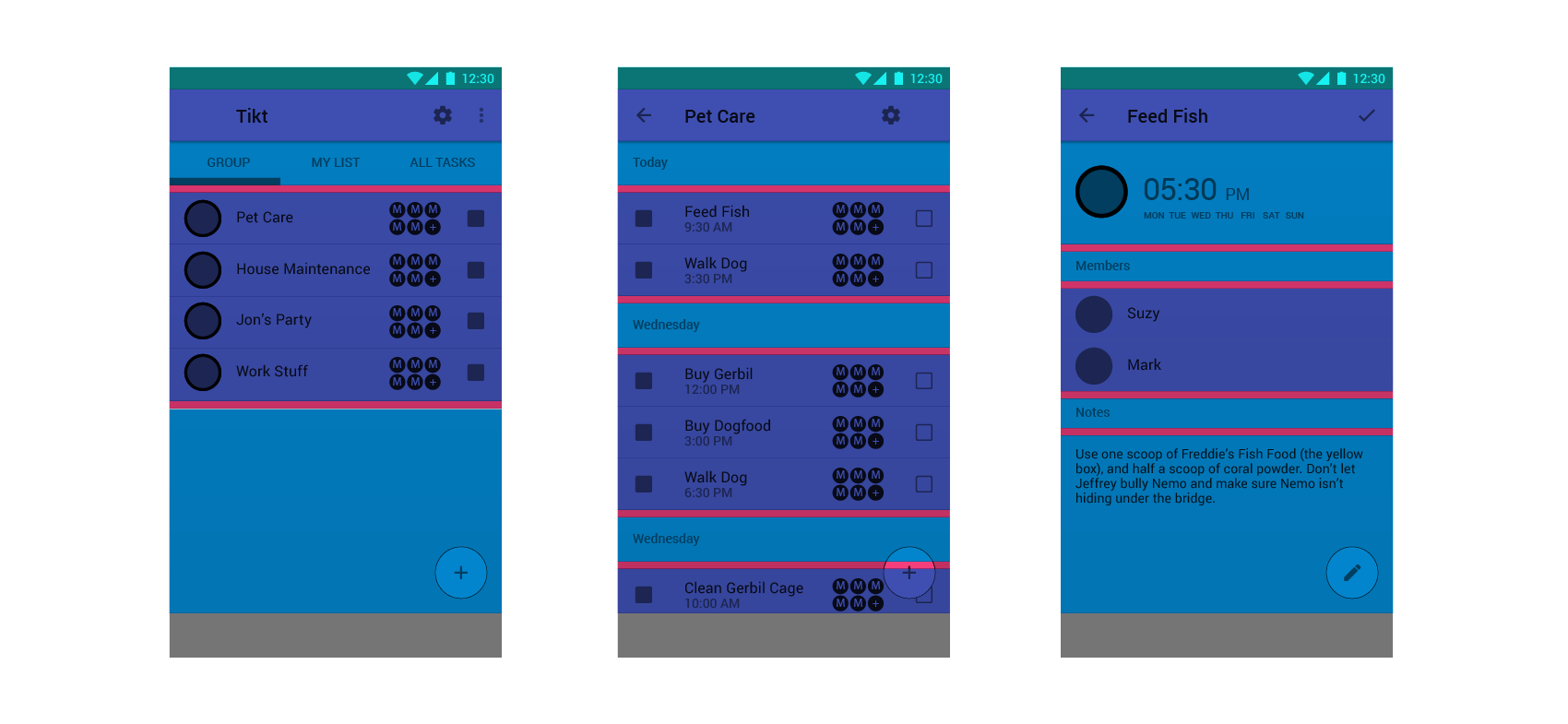
REVISION 2
Low Fidelity - Hand Sketched
BRANDING DESIGN
From the user testing, I found that people get enjoyment and a sense of achievement from completing tasks, so I made the click on the check-box and subsequent ‘tick’ an easily accessible feature and highlighted it as the main interaction of the app. This, in turn, dictated the app name, branding and logo; using a tick to top off the ‘i’ in the logo and primarily using the color green in our color palette.
Logo Development
Final Logo Design
Final Icon Design
Screenshots of color palette mock-up from material.io
MATERIAL.IO - Color Palette
The rest of the color palette consists of greys and a contrasting white to highlight icons and further functions. Initially, I based the design on a grey background and utilized the electric green colors and white highlights, but it affected the look and feel of the app, conveying an appeal almost like a computer game or technician’s software program. As the app should appeal to a larger demographic of people, I returned to a plain off-white background as this would still lift shadows and allow for contrast between the buttons and function but not look too whitewashed.
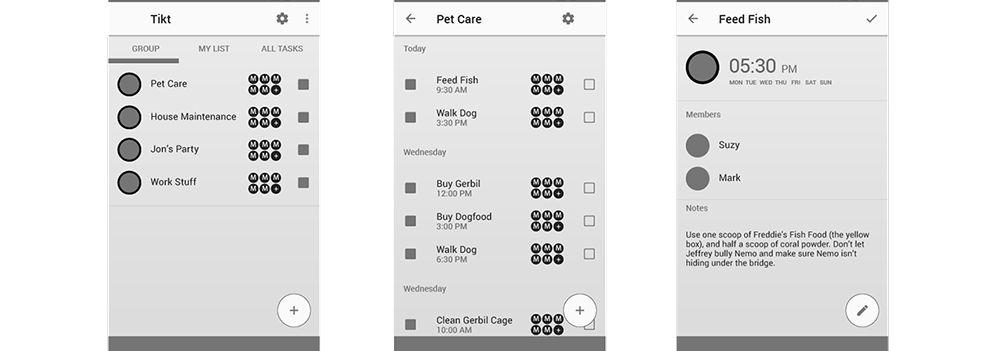
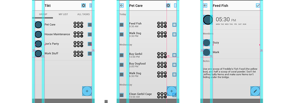
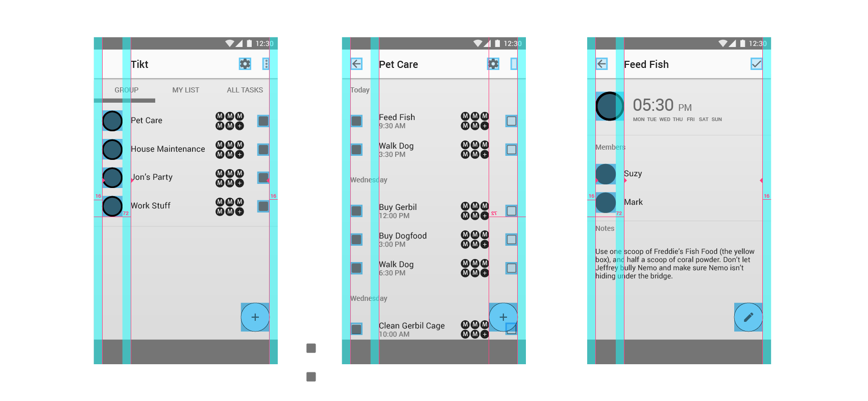
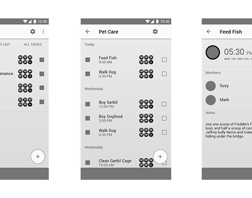
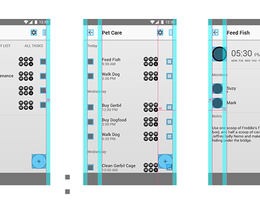
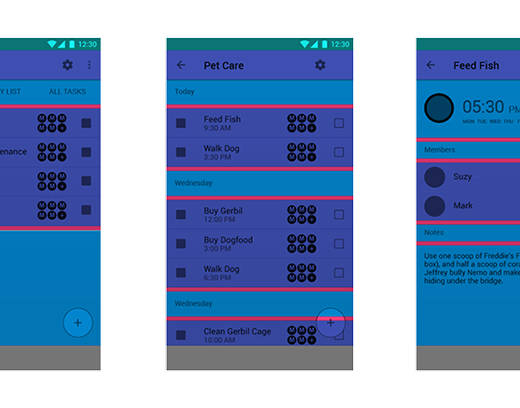
BUILDING THE SCREENS
Sketch
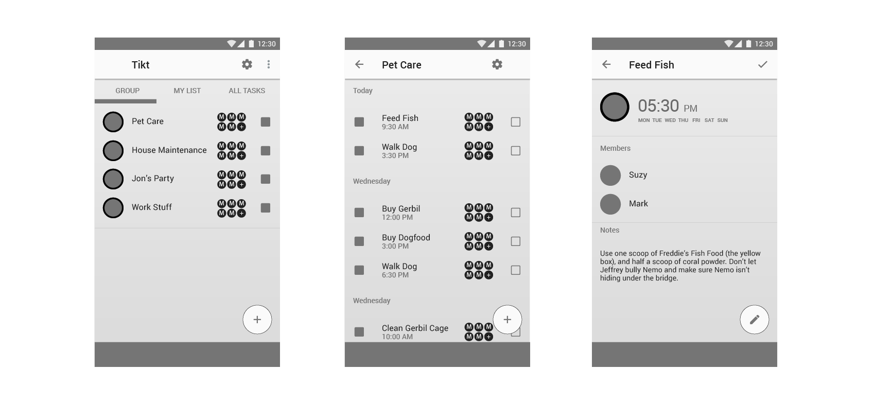


Initial layout done in gray-scale with no shading or texture added to elements.
Careful attention paid to the horizontal key-lines and touch target bounding boxes
Vertical spacing margins allow for precise alignment between list and content areas.
Once the layout is set, color was added to complement the brand
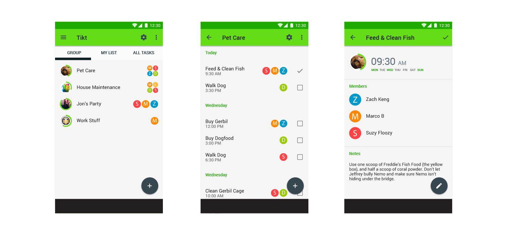
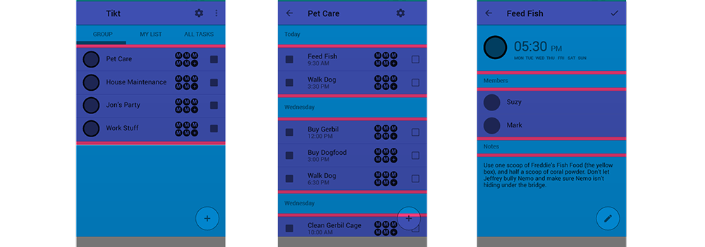
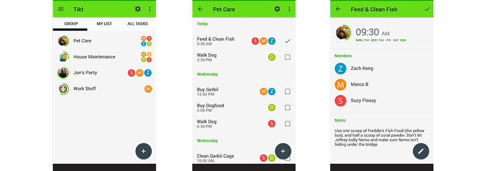
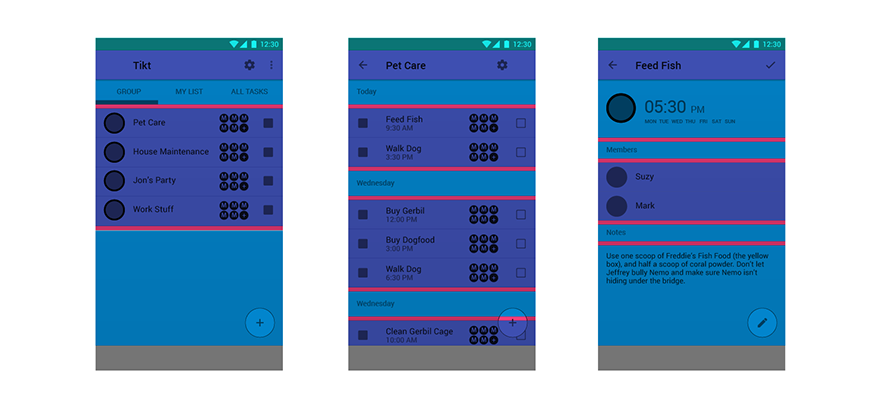
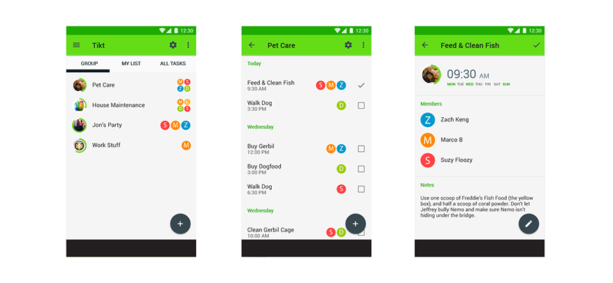
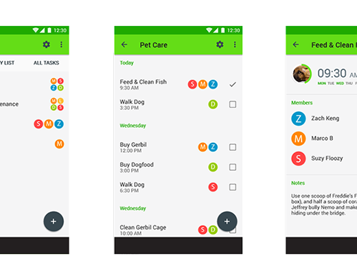
FINAL PROTOTYPE
High Fidelity - Invision
TASK 1
‘Feed & Clean Fish’ set the task to occur every Mon, Wed, Fri and Sun.
TASK 2
Add a new task - ‘Collect the Shopping’, set the time for 3:30pm on Thursday 13th April.
Click here for external link